
Charly
Butler
This portfolio brings together several years of study, experimentation, and growth. It highlights projects that explore identity, culture, and function, while always moving toward solutions that feel intentional and enduring.

Roller Con
Objective
The objective of this project is to rebrand RollerCon’s visual identity, including the logo, color palette, typography, and design language, to better reflect the dynamic, diverse, and evolving culture of the skating community. The updated branding should feel modern, bold, and expressive—honoring RollerCon’s rebellious roots while appealing to new audiences and future growth.
Solution
To capture the vibrant energy of RollerCon, I created a bold and inclusive brand identity that celebrates movement, individuality, and skate culture. The redesigned logo is dynamic and adaptable, working seamlessly across digital and physical platforms. A fresh color palette and expressive typography reflect the DIY spirit of roller skating while adding a modern edge.
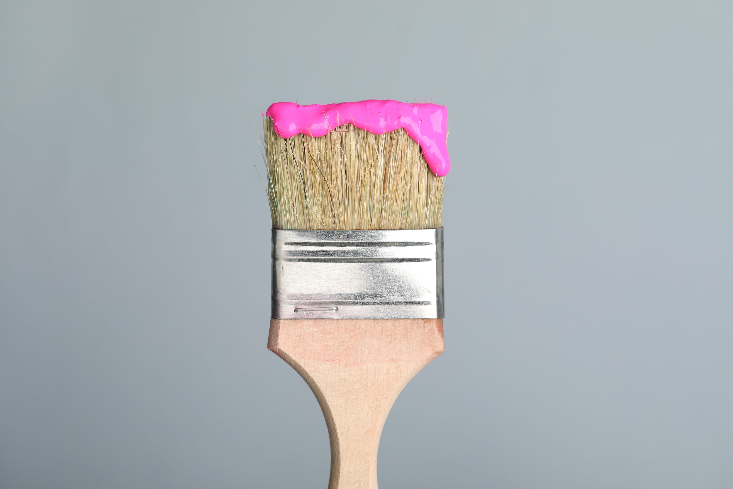
Remedy
Objective
The goal of this project is to design a cohesive set of branded materials for a hypothetical fan convention. The visual system should include digital and print elements that reflect the theme, tone, and personality of the event while ensuring consistency across platforms.
Solution
I developed a cohesive sub-brand under the HGTV Home by Sherwin-Williams line that reflects. a commitment to sustainability and design-forward thinking. The brand identity for Remedy is clean and modern, evoking trust, eco-consciousness, and ease of use. Packaging was created for both interior and exterior powder paints, with thoughtful materials and labeling that support an eco-friendly lifestyle.

Kickstradomis
Objective
The objective of this project is to develop a cohesive typographic system for a book that balances creative expression with clear communication. The design
must integrate multiple levels of hierarchy, thoughtful
spacing, and consistent styling to support both visual
appeal and functional readability across a variety of layouts.
Solution
For this project, I created a typographic book system featuring Salvador Amezcua, also known as Kickstradomis—a renowned shoe customizer known for designing bold, one-of-a-kind footwear for NBA, MLB, and NFL athletes. The design system captures the energy and individuality of his work through expressive type choices paired with clean, modern layouts.